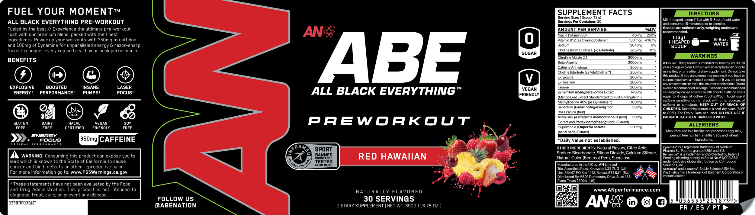
ABE™ also known as All Black Everything is a Europe’s #1 Best Selling Pre-Workout Powder. Coming from the UK, Applied Nutrition desired to see their stellar PRE reach the same level of success here in the U.S.
The challenge: While the formula was strong, the original dark aesthetic and outdated packaging made it less appealing next to more modern competitors.
Tasked with revitalizing Europe’s #1 best-selling pre-workout, I led the rebrand of ABE to better compete on U.S. shelves. As Lead Graphic Designer, I was responsible for conceptualizing and executing a bold new visual direction.
After rounds of iteration and creative development, the breakthrough came during a strategic meeting where leadership emphasized the importance of a unified global identity. I responded by incorporating our newest AN logo—expanded vertically along the side panel—paired with refined typography, modern iconography, and a graffiti-inspired gloss varnish layer for visual texture and shelf impact. The result was a striking, contemporary design that not only positioned ABE as a serious competitor in the U.S., but also prompted the UK team to adopt the look for consistency—making this a globally transformative project that launched just in time for Walmart’s modular reset.
Software’s: Illustrator, Blender 3D, Substance Painter, Photoshop
ABE™ OLD PACKAGING